phosphor-ui
- #react
- #ui
- #design system
- #storybook
on this page
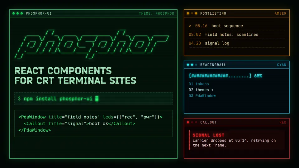
phosphor-ui is my React component library for sites that should look like a monochrome CRT terminal: green text, scanlines, glow, square corners. The mood comes from the PDA screens in S.T.A.L.K.E.R. and Tarkov. It targets the sites I actually build, which are blogs, wikis, course pages and project logs.
##What's in it
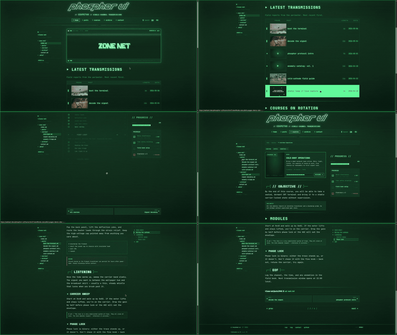
Everything is imported from the package root. Inside the repo the folders go from foundations and layout up through atoms, molecules, organisms and templates. A few of the pieces: CrtShell and PdaWindow (a window with rec, rx and pwr lights in the title bar) for chrome, PostListing, TableOfContents and CodeBlock for content, ContentEditor for admin screens, and SiteShell and Post as ready-made templates. The Storybook has the rest.
##How it's built
Components are styled with SCSS modules and bundled by Rollup to ESM and CommonJS. The CSS ships as phosphor.css, or split into tokens.css, fonts.css, typography.css, global.css and components.css if your app already handles some of that.
- Themes are set with
data-theme:phosphor,amber,cyanorred.ThemeProviderandThemeToggleswitch them, andgetInitialThemeScriptreturns an inline script that applies the stored theme before React loads. - Colors, sizes and glows are
--pho-*custom properties. Components carrydata-pho-componentanddata-pho-slotattributes, so an app can restyle them without targeting generated class names. CodeBlockcolors code with Shiki using phosphor themes, andphosphor-ui/serverexportscodeToPhosphorHtmlto do the same on the server.AsciiBannerrenders text with figlet (the Slant and Standard fonts are bundled).VideoPlayerwraps video.js.mdxComponentsmaps MDX headings,pre,blockquote,img,hrand links to the library's components.
The live link above is the Storybook, built from 86 story files. npm run validate:package type-checks, audits the public exports, runs Jest, builds, and smoke-tests the built package before a release. Pushes to dev publish prereleases to npm under next, and pushes to prod publish latest and redeploy Storybook.
##Install
npm install phosphor-uiReact 17, 18 or 19 is a peer dependency. @mdx-js/react is optional.
import { SiteShell, Post, Callout } from "phosphor-ui";
import "phosphor-ui/phosphor.css";

export default function App() {
  return (
    <SiteShell title="field notes" nav={[{ label: "notes", href: "/notes", active: true }]}>
      <Post title="Boot sequence">
        <Callout title="signal">Normal React or MDX content goes here.</Callout>
      </Post>
    </SiteShell>
  );
}##Develop
npm install
npm run storybook        # http://localhost:6006
npm run typecheck
npm run build            # rollup, output in dist/